A beautifully designed home can have premium furniture, elegant flooring, custom cabinetry and carefully selected finishes, yet still look ordinary when the lighting is poorly planned. In many cases, the problem is not the quality of the interior. It is the way the light interacts with it.
The most common lighting mistakes are surprisingly simple. Too many downlights, inconsistent colour temperatures, exposed LED strips, excessive brightness, poorly positioned spotlights and a lack of layered lighting can make expensive materials appear flat or harsh.
Good lighting should reveal the best features of an interior rather than compete with them. It should highlight textures, create depth, support everyday activities and make the room comfortable after sunset.
If your home has already been professionally designed, correcting a few lighting design mistakes may make a noticeable difference without replacing the furniture or finishes.
Why Can Poor Lighting Make an Expensive Interior Look Cheap?
Poor lighting can make an expensive interior look cheap because it creates harsh shadows, glare, uneven brightness and incorrect colour appearance.
Premium materials such as marble, wood, brass, artwork and textured fabrics depend on light to reveal their details. When the lighting is too harsh, too cool, too bright or poorly positioned, those materials can lose their visual depth.
For example, a luxury marble wall can look impressive under controlled accent lighting but flat under a random grid of ceiling spotlights. Similarly, high-quality wooden furniture may appear dull when the room has insufficient wall or accent lighting.
The goal is not simply to make the room brighter. The goal is to make the right things visible in the right way.
For a broader introduction to layered lighting, see Bright House's room-by-room layered lighting guide.
What Are the Most Common Lighting Mistakes in Expensive Interiors?
The most common mistakes include using too many ceiling lights, choosing the wrong colour temperature, ignoring glare, using decorative fixtures without considering scale, and relying on a single lighting layer.
Here are the mistakes that deserve the most attention.
1. Using Too Many Downlights
A ceiling filled with evenly spaced downlights may look organised on a drawing, but the finished room can feel visually busy.
This is one of the most common ceiling lighting mistakes in modern homes. Instead of creating a sophisticated atmosphere, excessive downlights can produce multiple bright spots and harsh shadows.
Downlights are useful when they have a clear purpose. They can provide ambient illumination or highlight specific areas, but they should not automatically be installed wherever there is available ceiling space.
A better approach is to ask:
- What area needs illumination?
- Is this light providing ambient, task or accent lighting?
- Will the light be visible from the seating position?
- Is another fixture already serving the same purpose?
- Does the beam angle suit the area?
Bright House's guide comparing downlights, spotlights and track lights explains how these fixtures serve different purposes.
2. Making the Entire Room Extremely Bright
More brightness does not automatically mean better lighting.
One extremely bright ceiling fixture can make a room technically well illuminated while making it visually uncomfortable. It can also flatten the room because there is little variation between walls, furniture and decorative elements.
Luxury interiors usually benefit from controlled contrast.
Instead of making everything equally bright, consider:
- Moderate ambient illumination
- Focused task lighting
- Softer accent lighting
- Wall illumination
- Decorative lighting at lower levels
This creates visual hierarchy. Your eye naturally moves toward the areas that deserve attention.
3. Ignoring Colour Temperature
Colour temperature has a major influence on how an interior feels.
A room with warm wood, beige upholstery and brass finishes can feel disconnected if some fixtures produce very cool white light while others produce warm white light.
For most residential spaces, warm white lighting around 2700K to 3000K is a useful starting point, although the ideal choice depends on the room, finishes and intended atmosphere.
Avoid selecting fixtures individually without considering the complete room.
Think about the relationship between:
| Interior element | Lighting consideration |
|---|---|
| Warm wood | Warm white generally complements it |
| Brass finishes | Warm light can reinforce the finish |
| White walls | Can appear warmer or cooler depending on the source |
| Artwork | Consider colour rendering and glare |
| Marble | Controlled directional light can reveal texture |
| Dark furniture | Requires sufficient surrounding illumination |
| Fabric | High-quality colour rendering can improve appearance |
For a deeper understanding of colour quality, see Bright House's Colour Rendering Index guide.
4. Choosing Fixtures Only for Their Appearance
A beautiful chandelier, pendant or wall light can become a problem when it is selected without considering the room.
The fixture needs to work with:
- Room dimensions
- Ceiling height
- Furniture scale
- Existing electrical points
- Fan position
- Sightlines
- Required illumination
- Overall interior style
A small decorative fixture can disappear in a large room, while an oversized fixture can dominate a compact space.
The best luxury home lighting does not necessarily come from the most expensive fixture. It comes from the fixture that is correctly proportioned and correctly positioned.
5. Installing Lights Without Considering Glare
Glare is one of the fastest ways to make a sophisticated interior uncomfortable.
A fixture can look attractive in a catalogue but become distracting when it is positioned directly in someone's line of sight.
This is particularly important for:
- Living room seating
- Dining tables
- Bedrooms
- Home offices
- Television areas
- Corridors
- Bathroom mirrors
Avoid placing bright exposed light sources where people naturally look.
Diffusers, concealed sources, appropriate beam angles and carefully positioned fixtures can make a significant difference.
The objective is to see the effect of the light rather than constantly notice the light source itself.
6. Using Exposed LED Strips Everywhere
LED strips are useful for creating concealed architectural lighting, but visible LED dots can quickly make an expensive interior look unfinished.
This is particularly noticeable in:
- False ceilings
- TV units
- Kitchen cabinets
- Wardrobes
- Headboards
- Display shelves
- Staircases
Where possible, conceal the strip inside an appropriate profile or use diffusion so that the room receives a continuous glow instead of a line of visible LEDs.
The light should emphasise the architectural feature, not become the feature itself.
How Does Layered Lighting Make an Interior Look More Expensive?
Layered lighting makes an interior look more refined by combining different sources for different purposes instead of forcing one fixture to illuminate everything.
The three basic layers are:
| Lighting layer | Purpose | Examples |
|---|---|---|
| Ambient | General illumination | Ceiling lights, recessed lights, concealed lighting |
| Task | Light for activities | Reading lamps, desk lamps, kitchen lighting |
| Accent | Draws attention | Spotlights, picture lights, wall lights |
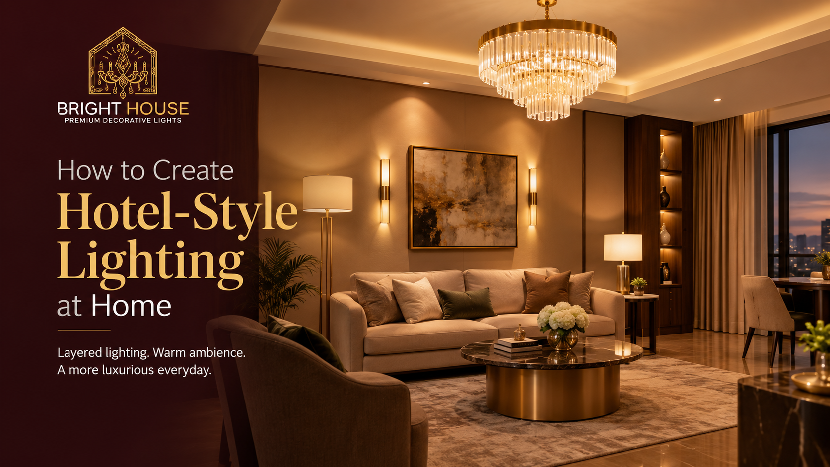
A living room, for example, could have a central pendant for ambient lighting, a floor lamp beside the sofa for reading and a directional light aimed at artwork.
Each light has a job.
That is the foundation of good interior lighting design.
For more room-specific ideas, see Bright House's living room lighting guide for Indian homes.
What Lighting Mistakes Make Furniture and Materials Look Flat?
The biggest mistake is using uniform lighting without considering the surfaces that need visual emphasis.
Different materials respond differently to light.
Wood benefits from directional light that reveals grain and texture. Textured walls can become more interesting when washed with light from an appropriate angle. Artwork may need focused illumination, while glossy surfaces require careful positioning to prevent reflections.
For example, if a feature wall is an important part of your interior design, do not automatically illuminate it with a bright ceiling light directly in front of it.
Instead, consider whether wall washing, grazing or controlled accent lighting would reveal the surface more effectively.
This is particularly important for wooden interiors. Bright House's guide on how to light wooden interiors without making them look dark covers this problem in more detail.
Are You Using the Wrong Beam Angle?
Yes, the wrong beam angle can make even a good-quality spotlight perform poorly.
A narrow beam can create a concentrated highlight, while a wider beam can provide broader coverage.
The correct choice depends on what you are lighting.
| Application | General approach |
|---|---|
| Artwork | Controlled directional beam |
| Decorative object | Narrower focused light may work |
| General wall illumination | Wider distribution |
| Reading area | Focused task lighting |
| Open living area | Broader ambient distribution |
| Display shelf | Controlled accent illumination |
Do not select every spotlight with the same beam angle simply because the fixtures look identical.
The beam needs to match the distance, target and purpose.
Why Does CRI Matter in Luxury Home Lighting?
CRI, or Colour Rendering Index, matters because it affects how naturally colours appear under artificial light.
This is especially relevant in expensive interiors containing:
- Artwork
- Natural wood
- Stone
- Upholstery
- Decorative fabrics
- Plants
- Brass and metallic finishes
- Statement furniture
A light source with good colour rendering can help materials appear closer to their intended colours.
However, CRI should not be considered in isolation. A high-CRI light can still create an unpleasant room if its brightness, colour temperature, beam direction or glare control is poor.
Good lighting is a combination of several factors rather than one specification.
Can Mixing Different Colour Temperatures Make a Room Look Cheap?
Yes. Randomly mixing colour temperatures can make a room feel visually disconnected.
Imagine a living room where the ceiling lights are cool white, the wall lights are warm white and the decorative cabinet lighting is noticeably yellow. Each fixture may look acceptable individually, but together the room can lose visual consistency.
A coordinated colour temperature strategy is usually more effective.
If different temperatures are necessary because of different functions, create intentional zones rather than mixing them randomly.
For example, a kitchen work area may require a different lighting approach from a relaxed living room, while a decorative accent can be warmer than the functional layer.
The difference should feel deliberate.
Are Decorative Lights Being Used Without a Purpose?
Decorative fixtures should contribute to the overall design rather than simply occupy empty electrical points.
Before installing a decorative light, identify what it contributes.
It could:
- Create a focal point
- Add symmetry
- Highlight architecture
- Provide task lighting
- Create atmosphere
- Add visual height
- Balance furniture
- Illuminate artwork
If a decorative fixture has no clear role, it may become visual clutter.
A luxury interior usually feels intentional. Every major element should appear to belong to the composition.
Are Your Lights Correctly Positioned Around Furniture?
Furniture should be considered before finalising lighting positions.
A common mistake is planning the lighting grid first and arranging furniture later.
This can lead to lights shining behind seating, directly into people's eyes or nowhere useful.
Before final installation, mark:
- Sofa positions
- Dining table
- Bed
- Reading chair
- TV
- Artwork
- Cabinets
- Display units
- Kitchen work surfaces
Then determine where the light should fall.
This simple process can prevent many interior lighting mistakes.
What Are the Biggest Lighting Mistakes in a Luxury Living Room?
The biggest living room lighting mistakes are using one central fixture, installing excessive downlights, ignoring furniture placement and forgetting lower-level light sources.
A balanced living room can include:
- A properly scaled central fixture
- Wall lighting
- A floor or table lamp
- Accent lighting for artwork or architecture
- Concealed lighting where appropriate
- Separate switching or dimming for different layers
This allows the room to change throughout the day.
Bright House recommends distributing light across multiple sources rather than depending on one extremely bright fixture.
How Can You Fix Lighting Mistakes Without Renovating the Whole Room?
You do not always need to replace the entire lighting system.
Start with the most visible problems.
Quick improvements
- Replace excessively cool bulbs with a more suitable colour temperature.
- Add a floor lamp to a dark seating corner.
- Use table lamps on consoles or side tables.
- Add controlled accent lighting to artwork.
- Reduce unnecessary decorative lights.
- Use diffusers or profiles for visible LED strips.
- Install compatible dimmers where possible.
- Reposition adjustable spotlights toward architectural features.
- Reduce glare from exposed sources.
- Separate lighting circuits where practical.
Small changes can improve the balance of a room without changing its furniture or flooring.
For example, if a living room feels flat, adding one well-positioned floor lamp and one accent light may be more effective than adding six additional ceiling downlights.
What Should You Check Before Finalising an Interior Lighting Plan?
Use this checklist before purchasing or installing fixtures:
- Measure the room dimensions.
- Check the finished ceiling height.
- Mark furniture positions.
- Identify artwork and feature walls.
- Decide the ambient, task and accent layers.
- Select a consistent colour temperature strategy.
- Consider CRI for important materials and artwork.
- Check beam angles.
- Plan for glare control.
- Confirm fixture scale.
- Check dimming compatibility.
- Coordinate lighting with ceiling fans.
- Avoid unnecessary downlight grids.
- Plan switching before electrical work is completed.
- Consider maintenance and cleaning access.
A lighting plan created around the actual room will almost always perform better than one based only on a fixture catalogue.
What Is the Difference Between Expensive Lighting and Expensive-Looking Lighting?
Expensive lighting refers to the cost of the fixture. Expensive-looking lighting refers to how effectively the complete lighting system makes the room feel.
A premium chandelier cannot compensate for poor surrounding lighting.
Likewise, a reasonably priced fixture can look sophisticated when it has:
- Correct proportions
- Appropriate colour temperature
- Good colour rendering
- Controlled brightness
- Proper positioning
- Minimal glare
- Supporting accent lighting
- A relationship with the furniture and architecture
The appearance of luxury comes from coordination.
What Is the Simple Rule for Avoiding Lighting Mistakes?
The simplest rule is: do not design lighting fixture by fixture. Design it layer by layer and room by room.
Start by asking what the room needs to do.
Then determine:
What needs general illumination?
Where do people need focused light?
What deserves visual emphasis?
Where could glare occur?
Which materials need accurate colour rendering?
What should remain visually quiet?
Once these questions are answered, fixture selection becomes much easier.
The Bureau of Indian Standards resource covers Indian standards for LED lighting, including performance requirements and parameters such as luminous flux, efficacy, CCT and CRI, which fits naturally with the article's sections on lighting quality and colour rendering.
Frequently Asked Questions
1. What is the most common lighting mistake in modern homes?
One of the most common mistakes is relying too heavily on a single ceiling-lighting layer. This can create a bright but visually flat room.
2. Can too many downlights make a room look worse?
Yes. Excessive downlights can create glare, visual clutter and uneven pools of brightness. Downlights should have a specific lighting purpose.
3. What colour temperature is best for luxury interiors?
For many residential areas, 2700K to 3000K warm white is a practical starting point. The final choice should consider the room, materials, furniture and desired atmosphere.
4. Is warm lighting better for expensive interiors?
Warm lighting can complement many residential materials such as wood, brass and warm-toned fabrics. However, lighting quality also depends on brightness, CRI, distribution and glare control.
5. Does high CRI make lighting better?
High CRI can improve colour appearance, especially for artwork, fabrics, wood and decorative materials. However, CRI is only one part of a complete lighting plan.